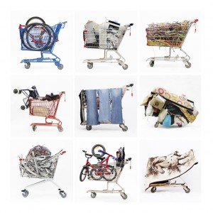
 Brian Howell is a editorial photographer who has made a smart jump into the fine art world. His first series that gained a critical following featured wrestlers – shot in smudged blacks and cool greys – with their cheap costumes and carnival styling. A later series focused on celebrity impersonators who turn a party trick into something more compelling and weird and modern. The tones here are theatrical, all black shadow and flashbulb bright. For Howell’s latest exhibition – which recently closed at Winsor Gallery on South Granville in Vancouver – he photographed individual metal shopping carts filled with a curious array of objects collected by different binners, or dumpster divers. Howell bought the carts and contents outright at whatever price the seller asked in a fair trade effort between street-smart recycling and creative re- purposing. Howell made a good deal because this collection of photographs is superb.
Each individual cart is set against a medicinal white background so that it becomes a specimen of urban behaviour. All these things got used up, worn down and thrown away only to find an odd new life as art objects. Howell’s attention to shape and colour is sharp. One cart is side- wrapped by an oversized fleamarket painting of multiple Spanish toreadors garishly coloured in flaming purples and brothel reds. In another photograph, the cart is full of plastic bottlecaps in a mix of colours – juiced up reds, artificial greens and Pepsi blues. The colours here have all the fizz of sodapop and give the image a sugary charm.
In preparing for his exhibition, Howell knew that colour would serve as a signifier for a consumerist mentality and needed to be precisely calculated. The electrical wires in one cart had to pulse with a bright yellow and juiced up green. The blue on a discarded big screen TV box had to have that washed out feel, as if weathered by rain. Howell chose to print all of the photographs himself but needed to have his wide-format printer properly calibrated. Chromalink was contracted to work with Howell to ensure that his prints achieved a truthful document of the tone and colours for every object. Even the whites had to be sharp. Chromalink aligned the colour values for every device in Howell’s studio which allowed him to work without doubting that he had the colours right. And since each print was part of a larger edition, Howell needed to know that his colours would be predictable and consistent. Chromalink gave Howell confidence in his colours and he made the most of it.
http://www.brianhowellphotography.com